Leo’s Fortune is a platform adventure game for iOS created by a small team of game designers. The title features beautifully rendered artwork, excellent gameplay, and wonderful storytelling and voice work. Two months since my first go at this game and the experience is still playing back in my head.
Founded by Johan Knutzen, Shahrouz Zolfaghari, and Anders Hejdenberg, 1337 & Senri is best known for creating Devil’s Attorney and Dark Nebula 1 & 2; games released to critical acclaim.
Now, with the addition of Leo’s Fortune, the awards and acclaim continue to stack up having landed a coveted 2014 Apple WDDC design award.
Being obsessed with the story and process behind the games, I had a conversation with Anders, lead designer on Leo’s Fortune. The result; insight into the development process, a first look at a sampling of concept art and great advice for those looking to throw their hat into the game design ring.
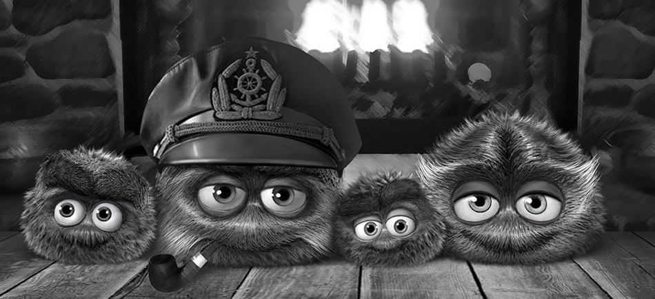
Tell me a bit about your journey into game design and development. How did you get here?
Anders Hejdenberg: I started at around age twelve making pixel art on my home computer. At age 16 I started working for a local games company in my free time, doing 3d intro sequences for their games. After my army duty I became a full time employee at that same company, which I guess was the formal start of my career in the games industry. Since then I’ve worked for many different studios, either as an employee or a freelance artist/designer. It’s only in the last couple of years that I’ve been making my own games in my own company.
Can you tell me a bit about the people that worked on this game, and their background?
AH: We all have different backgrounds; mine is from making console and PC games. Johan Knutzen and Shahrouz Zolfaghari are the programmers. They studied together at the technical university in Gothenburg and then decided to make their own games in their own company (Senri). Karin Bruér, who did a lot of the art for the game, studied at a game school in Sweden, and is now working as a freelance artist for various studios. Andreas Roman, who wrote the story, is an industry veteran who not only writes stories but also does game design. I worked with him at DICE many years ago, but we actually got to know each other before that when he was writing the story for a game at the studio where I began my career.
What engine did you build this game on, and what brought you to the decision to use this engine?
AH: We built our own engine for this game. Our programmers are used to making their own engines, and since the game needed a lot custom solutions we felt that it would be most efficient to create our own engine and tools this time as well. But we did use third party solutions for a couple of things like sound and physics.
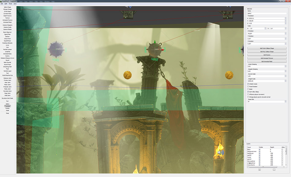
As you worked on this game, what were some of the biggest hurdles you had to overcome?
AH: The biggest challenge was definitely to create the sheer amount of artwork for the game, and getting it to run smoothly on all devices. We don’t use any tiles in the game, so each level is basically one huge canvas where every pixel is unique. It was a lot of fun to just be able to create whatever environment you could dream up, but it was a lot of work to get that artwork into a size and format that would work on mobile devices.
The programmers had to write some clever tools that would analyze the levels and split them into smaller chunks based on what type of art they contained. We used different compression algorithms for different types of art so that we could get the four gigabytes of raw art data down to less than 250 megabytes in the end. And the beautiful thing is that you can’t even see the difference in visual quality.
After that the programmers built a streaming system that would decompress and stream all the data as you progress through a level. We had to do it that way because we would never be able to fit all the decompressed data for one level into memory at the same time.

What was the largest level canvas you created?
AH: The largest canvas in the game is for level 18, which is 57k by 14k pixels.
The Leo’s Fortune story strikes me as a pretty deep subject based around the idea of greed. How did this story come about?
AH: If there’s one thing that’s not associated with a platform game, it’s a deep and meaningful story. Especially in a platform game set in a fairytale-like world with a cute and fluffy main character. So we figured that since no one will ever see it coming, we will hopefully be able to catch some players with their guard down; making the effect even more powerful. The story itself revolves around greed and life choices, and it’s a story that we feel is very important.
When we decided to work in this industry, we did it out of a love and passion for video games. But we would gradually realize that the industry is powered by people who have a completely different agenda, and that is greed. I can understand that some people feel accomplished when they earn a lot of money, and that’s fine. But when making money for yourself becomes more important than providing value for others, things change quite drastically. This is what I’ve seen in the console and PC games industry, and that’s why I decided to leave and make my own games instead. So I guess that is why we felt that the subject is something that’s important to bring up; especially in a videogame.
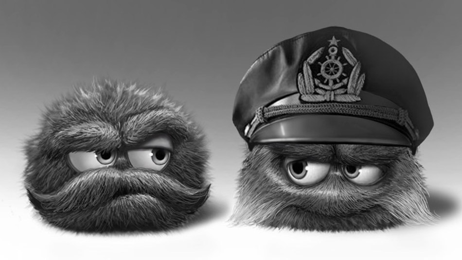
Leo is quite a different character. How did the design process go when creating him?
AH: It wasn’t so much a process as just sitting down one day and creating some different mockups in Photoshop. If there was any process at all to speak of, I’d say that I designed Leo from the perspective of what I thought was interesting rather than what I thought that other people would find interesting. It’s not that I don’t care what people think, but it’s rather that I think the design becomes much more direct and sincere when you do it that way. The end result was a character that displays a number of different traits, just like the people you meet in your everyday life. There’s a bit of depth there that you don’t usually see in game characters. Just by looking at him you can see his stubbornness, his quirky nature and his humor. But you can also see that there’s some sadness and insecurity in him. All of these things together makes Leo a character that I at least find interesting.

One of the design features that stood out to me was how you explained particular actions to the player through illustrations. Did players take to it quickly, or was it a testing process to get it to a place that was intuitive?
AH: Our philosophy is to try to communicate as little as possible and instead just create settings where the player can safely play around and figure things out for themselves. When you’re told to do something, you will easily forget it afterwards. But if you get to figure something out for yourself, you will not only remember it better but you will also feel a bit clever in the process. However, in some situations we found that this was simply not enough so we had to give the players some hints on what was required of them. Most of these illustrations worked really well, but there were some that we just had to remove and rethink the level design instead. For example, we used to have arrows to indicate that the player was expected to go up a ramp through a half-loop. Nine out of ten players would understand, but the last one interpreted the arrow as an indication that they should swipe in a half-circle pattern across the screen which essentially made it impossible for them. Since the illustrations had the ability to both inform and potentially misinform, we made sure to use them only when absolutely necessary and to also test them on a number of different players. However, we still saw some minor issues. For example, there’s a skull with crossbones symbol that we use to warn the player of danger in some places. There’s one place in the game where there are three buttons on the floor that trigger a large block with spikes on it to fall down on the player. Since we didn’t want players to just die without warning, we put the skull symbols over the buttons to warn them. This worked really well, but one player still interpreted it backwards and thought that the only way to avoid triggering the trap was to jump from one button to the other without touching the ground. Another player even interpreted the crossbones below the skull as an X that crossed over the skull and thereby nullifying it. So they would steer towards the skull symbols whenever they saw them in a level. However, in the end we felt that we helped a lot more players than we killed, and the players who misinterpreted the symbol would soon understand too. And since there’s no real penalty for dying in the game, it wasn’t really a big deal.
The levels are so incredibly rich and makes great use of fore, mid, and background elements, it sucks you right in. What was the mix of 3d rendering to digital painting within the levels and how did you approach that process?
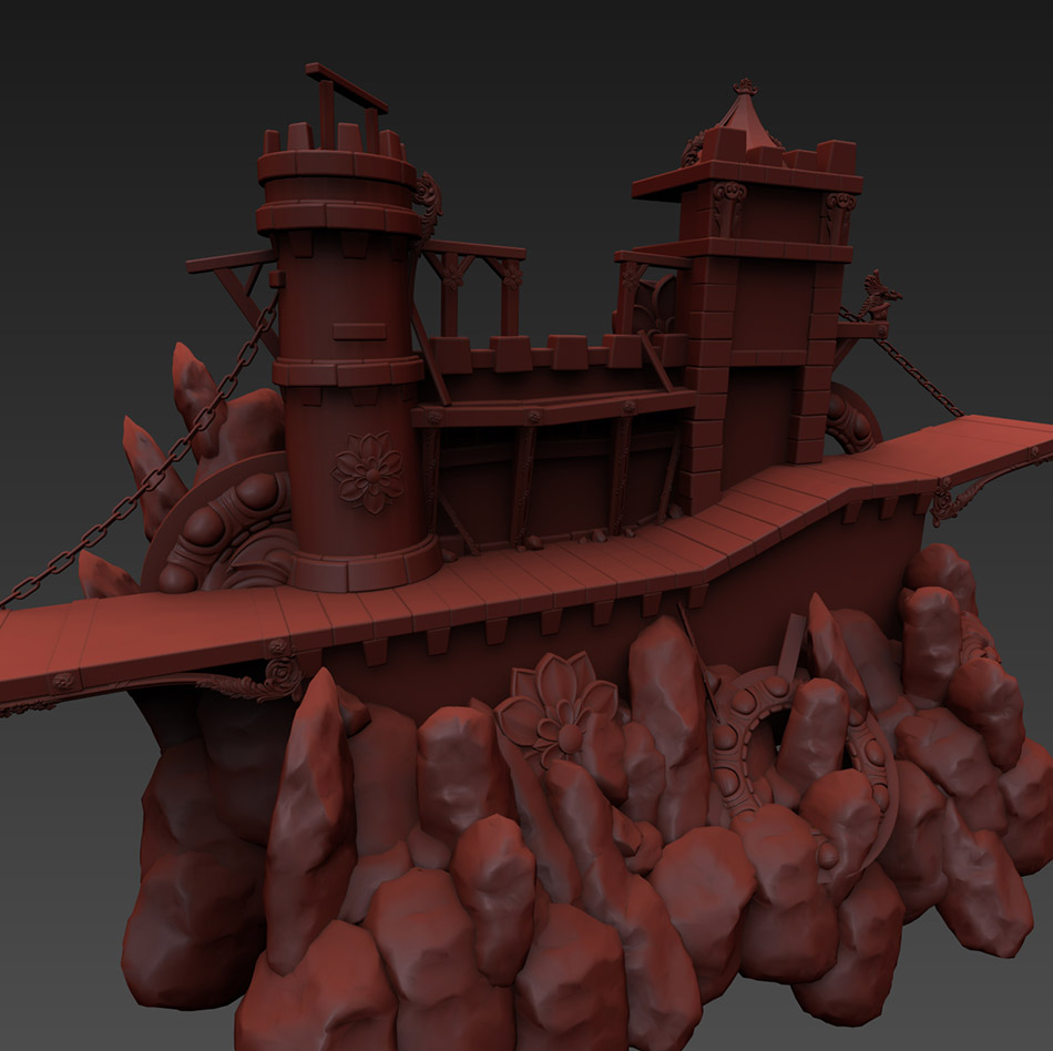
AH: The use of digital painting versus 3d-rendering was mainly based on the type of environment we were creating. Organic objects like forests or trees are much easier to do in Photoshop than in 3d, and it usually looks much better as well. But even in the bits that were rendered, we still did a lot of detail work afterwards in Photoshop to add things like dirt, rust, cracks and glow. We also adjusted the colors and contrast to make all the elements fit together.
What is one piece of advice you’d offer someone entering game design for the first time?
AH: My advice would be to first read as many interesting books and articles on the subject as you can, and then apply it in the smallest scale possible by creating a very small game. When you’re creating something small, you have to rely on the most basic fundamentals of design and since the game is small you can iterate on it much faster. Test it on a bunch of people and find out what works. See what people’s reactions are and adjust the design until you get the desired result. When you’re ready, you can make another game with more complexity to it (if that’s what you want). I also think that everything in the world is related in one way or the other. So if you want to come up with something that’s new and fresh it really helps if you’ve done something besides playing video games all your life. If you’re really interested in music, you will be able to add that to your design. If you’re really interested in psychology, it will help you communicate with players in new ways. If you’ve traveled a lot you may come up with some really interesting settings for your game. A game is a mix of many different forms of entertainment, and the more you know about the world the more likely it is that you will have something new and different to offer the player.
Leo’s Fortune is available on iPhone, iPad and iPod in the Apple Store for $4.99. It’s money well spent for a game that will stick on your best mobile games list for quite some time.

 …WOOLY DESERVES BETTER LOL!