In 2013, we were gifted with one of the most anticipated game reboots in history: Tomb Raider. We collectively got to see Lara Croft come back to life, but not as her brilliant, hardened and somewhat cold self. No, we got to see her before she was the Lara Croft we all came to know and love throughout the years. Not only was Crystal Dynamics‘ Tomb Raider a reboot, it was also a prequel to begin an entirely new series. We finally got to see what Lara was like before she turned into the stone-cold tomb raiding icon we were introduced to in 1996. What we got was nearly the antithesis of what we knew: An equally brilliant, though unseasoned, emotional, caring, tomb-hating, up-and-coming adventurer fresh out of university on her first trip with a group of colleagues and, most importantly, friends, in the hopes of finding the lost island of Yamatai. Just as important as her personality, however, was the question of how Crystal was going to revamp her look. Over the years, we’ve seen a number of revisions and redesigns to the character design of Lara Croft – from the unrefined, angular and ever so busty rendition of early games created by Core Design, to the more realistic, but just as s*** portrayal of the Lara at the hands of Crystal Dynamics in the early 2000’s when the game was revamped. Granted, within all of the game developments over the years, the overall character design has retained specific traits that are characteristically Lara – the signature long braid (though sometimes a ponytail), duel hip-holster semi-automatic handguns, military boots, shorts, full lips, and bright brown, cat-like eyes. The question was, when the game was first announced, how was Crystal Dynamics going to make Lara look? Would she highly resemble the Lara we all knew, or would they completely revamp her look along with the game and story themselves? Would she look like some sort of hybrid old and new?
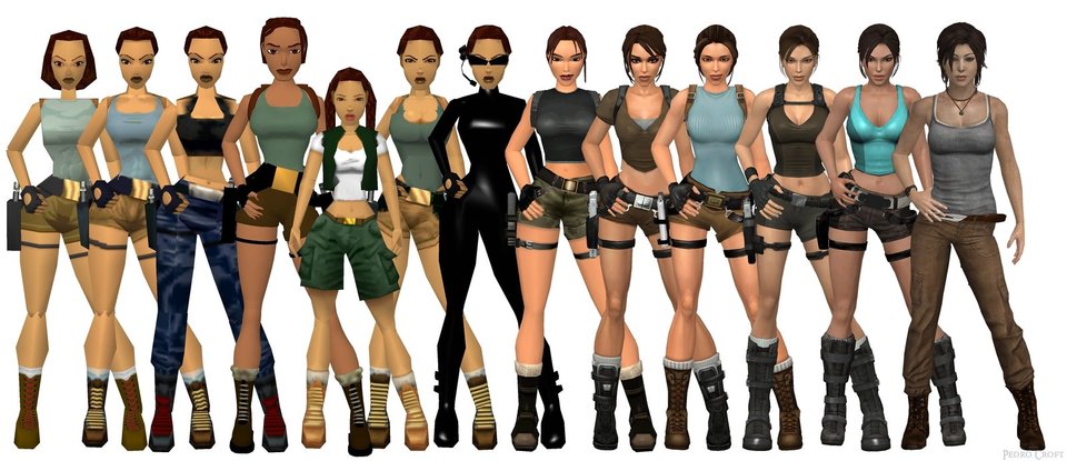 Turns out we weren’t let down – Crystal Dynamics created a mature, though noticeably younger and softer version of Lara Croft. She has yet to become the hardened killer that we have known her as all these years. Opting out of the traditional braid and going with a messy ponytail with, dare I say, bangs, bright eyes and full lips, though she is less curvaceous and arguably one of the most realistic portrayals of a woman in gaming, and without a doubt the most realistic rendition of Lara that we’ve seen so far. As always though, the renditions in games are only as good as the technology of the consoles in which they are played. This year, we also saw the re-release of Tomb Raider with the Definitive Edition for the next generation of consoles: Playstation 4 and X-Box One. With the new technology and graphics capabilities of these consoles, they allowed for new effects and features to be utilized to enhance the gaming experience, immersing the players in the most realistic environments and character designs to date. Though the 2013 edition of the game was beautiful, itself a work of art, how does it compare to the Definitive Edition? It’s not only the question of how do they compare that matters, but also, how true was each game release to the concept art? Let’s start with the first release of the game.
 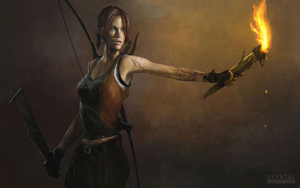 Above is one of the early pieces of concept art for the design of Lara. She’s fit, lithe and athletic in build. She still definitely has the feel of a seasoned killer though, what with the machete in hand and “I dare someone to come up behind me” look.
 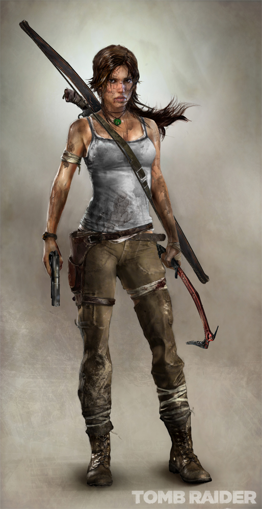 Here’s the design Crystal Dynamics settled upon though. She’s still got the daring look and athletic build, but she’s softer and slightly more curvy, lending herself to a more young and just past maturation physique. Now here’s what she actually looked like rendered.
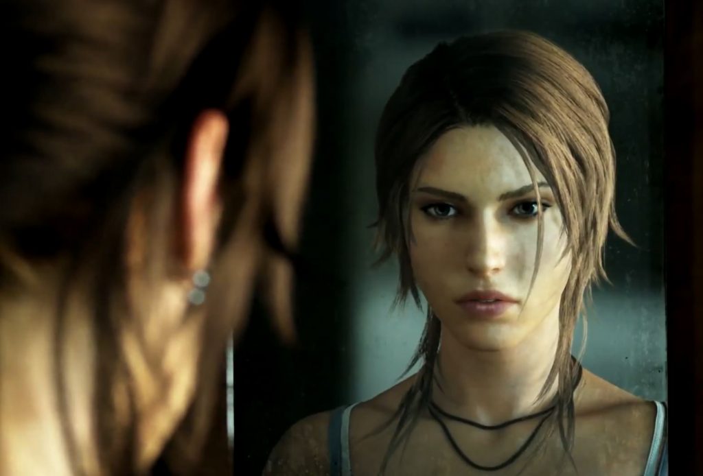
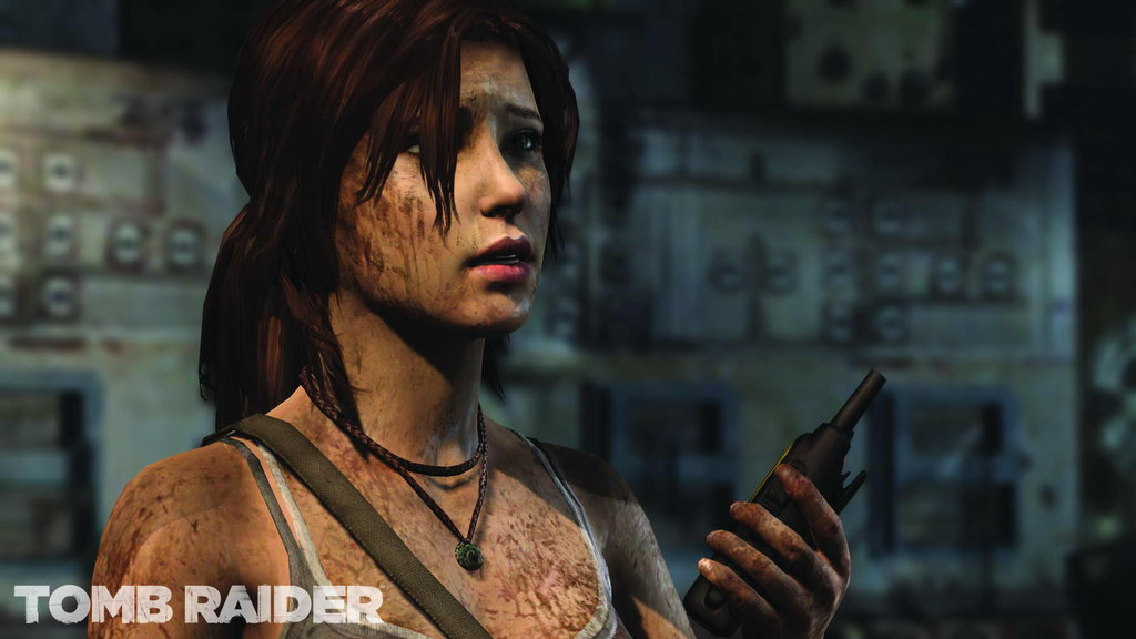
Overall, the render is very true to the concept art – facial features, costuming, grungy buildup of substances that we really don’t want to know are made of, the whole nine yards. It’s all nearly spot-on with how the artists wanted Lara to look in the game. However, if you look closely, Lara’s render still seems rather gamey, if you will. The lighting is off just a bit here and there, the shadows don’t necessarily line up in the correct areas and seem layered on – not integrated as well as they should be for a realistic render. They feel as if they’re simply painted on top of her figure, whereas in reality, shadows are a result of light not being able to penetrate surface layers, so they’re an absence of light, not a form of light themselves. Another huge difference, the biggest really, is her hair. This has always been a bit of a pet peeve of mine, when the capabilities of consoles don’t allow for properly rendered hair – long hair especially. It seems as if no one has ever really been able to get it right, Tomb Raider included. While it’s one of the better renderings of a ponytail I’ve seen, being detail oriented, it still nagged at me while I was playing through the game. Clumpy, stiff hair, awkwardly blowing in the wind as a unit, not individual strands. Cue the Definitive Edition. I’ve got two words for you: Nailed. It. The Definitive Edition renders of Lara Croft are some of the most realistic character renders I’ve ever seen in my 20+ years of gaming. All I can say is wow. Just wow. I mean, look at this:
 It’s like the difference of night and day. With the next gen tech, not only were they able to implement sub-surface lighting to fix the shading, but with the TressFX Hair component that was used with the Definitive Edition, Lara’s hair actually looks real. It’s almost as if you can reach out and touch it. Here’s a better look at her face and the sub-surface lighting:
Lara’s hair is a richer brown, her eyes more pronounced and slightly more cat-like than the first release. And, of course, as I mentioned earlier, the lighting and shadowing of the character render are much more realistic. They don’t seem tacked or layered on as they were with the original release. With the tech enhancements of the next gen consoles, the designers were able to penetrate the first surface layer of Lara’s render, so the light literally penetrates her skin and reflects realistically, creating a much more natural, softer glow. This results in better integration of the character into the environment, as well as allowing the lighting in the environments themselves to be more realistic.
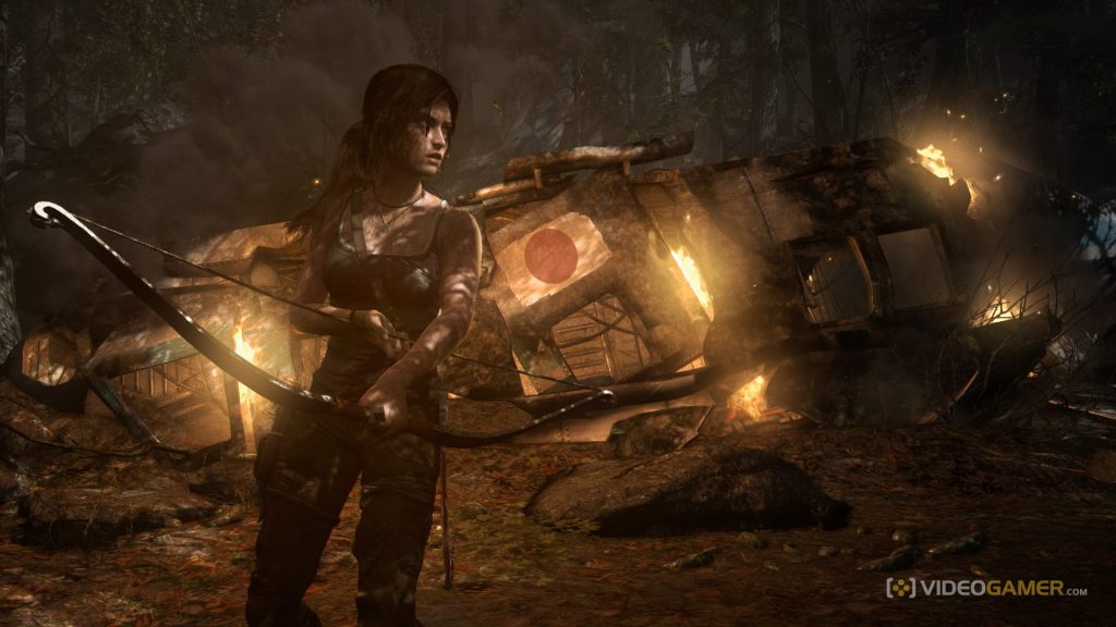
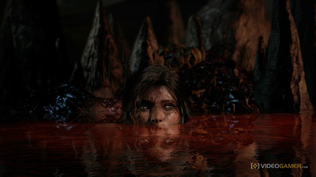
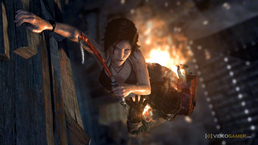
All in all, both of these releases were visually amazing, but the Definitive Edition totally takes the cake. The environments are stunning – it feels as if you can reach out and touch nearly everything. The next generation of consoles have completely raised the bar for how games should and will look in the future. I have to say, I think it was extremely wise of Crystal Dynamics to take advantage of their already beautiful release of an iconic game and boost Lara Croft into the new world of gaming, successfully grabbing the attention of next gen gamers and a new generation of gamers all together. So get out there, grab yourself a copy of the Definitive Edition and enjoy the mouthwatering environments and character designs of Tomb Raider.

 …WOOLY DESERVES BETTER LOL!